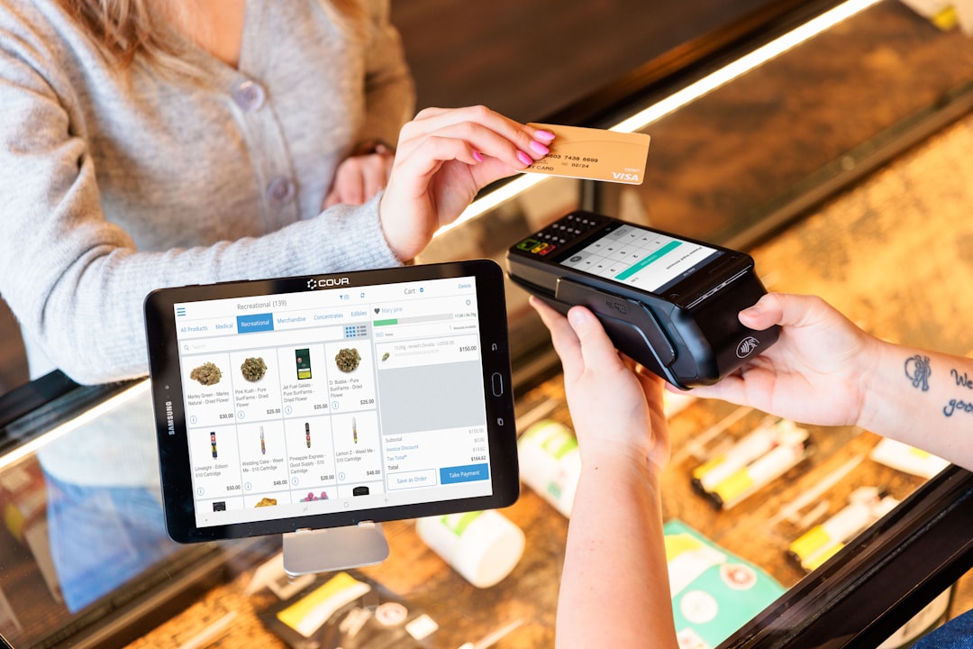
Shopping online in 2025? You’re not alone. With a few clicks, you can compare a dozen products. But guess what? Lots of brands still mess this up. A good product comparison page can turn a maybe into a yes. Let’s dive into how to build one that really converts—without boring your visitors to tears.
Why Comparison Pages Matter
People love choices. But too many choices? That causes confusion. That’s where comparison pages shine. They help shoppers:
- Understand differences
- Pick the right product faster
- Feel confident about their buy
A well-designed comparison page builds trust. And trust leads to clicks. And those clicks? They turn into sales.
What Makes a Comparison Page Great
Okay, so what goes into a winning comparison page?
Simple structure. Clear text. Honest info. Let’s break it down:
1. Clean Layout
Use tables, cards, or grids. Don’t try to cram everything into one column. Keep it tidy and responsive on mobile. In 2025, more buyers are shopping on phones than ever before. Give them a layout that scrolls smooth and looks great.

2. Use Visual Cues
Icons, bullet points, badges like “Most Popular” or “Best Value” – they help quickly guide users. People skim. Help them skim smarter.
3. Highlight the Winner
Every list needs a hero. Highlight one product that stands out with a color pop, or star icon. Show why it’s the best choice.
4. Feature-by-Feature Comparison
Don’t just show the color options or price. Go deep. Include things like:
- Performance rating
- Warranty length
- User reviews
- Battery life (if relevant)
The more meaningful the info, the higher the trust.
5. Filters and Preferences
Let users sort by what matters: Price, features, brand, rating. Giving control makes people feel smarter. And smart shoppers buy faster.
Design Trends for 2025
Design changes fast. What’s hot this year?
- Dark mode friendly layouts that reduce eye strain.
- AI summaries – tools that give a short verdict for each product.
- Micro animations that delight without distracting.
- Voice-friendly design for assistant browsing.

Be Honest. Be Real.
No one likes feeling tricked. Show the weak spots too. Say, “Not ideal for gaming” or “Limited color range.” Honesty leads to trust. When people trust you, they’re more likely to buy from you – even if the product isn’t perfect.
Call to Action = Must Have
Don’t forget your CTA (Call to Action). A small “Buy Now” or “Learn More” button can make all the difference. Place it:
- Below each product card
- In the table row
- Sticky at the bottom for mobile
Make sure it stands out – bold color, big enough, and clear.
Test, Then Test Again
You made your page? Great start. Now test it!
Use A/B testing to check:
- Button colors
- Table layout vs. card layout
- Language – “Most Popular” vs. “Top Choice”
Even tiny tweaks can boost conversions. Never stop testing.
Conclusion
In 2025, comparison pages will be critical touchpoints. Get them right, and you’ll turn indecisive visitors into happy customers. Just remember:
- Keep it clean
- Be honest
- Guide with visuals
- Highlight your best
Oh – and make it work great on mobile. That’s where your next sale is coming from.
So go ahead – build a comparison page that not only informs but converts. Your customers (and your bottom line) will thank you!


