


A free trial CTA should appear above the fold, use benefit-led copy, and remove every extra second between interest and signup. The homepage has one job: help the right visitor understand the offer and start the trial without confusion. A strong call to action is not just a button. It is the promise, placement, contrast, friction level, and trust around that button.
TLDR: A homepage free trial CTA works best when it is visible in the hero section, repeated after proof points, and written around the user’s desired outcome. For example, a SaaS homepage that changed “Submit” to “Start Free Trial” and moved the button above the fold could see a 12% to 25% lift in trial starts, especially on mobile. If a trial form asks for too much too soon, conversions often drop because visitors lose patience before seeing value.
What Makes a Free Trial CTA Convert?
A good free trial CTA tells visitors exactly what happens next. It should answer three silent questions: What will be received? How much effort is needed? Is there risk?
Weak CTAs often say “Get Started” or “Submit.” Those words are vague. They create hesitation. Better CTA copy uses direct intent, such as:
- Start Free Trial
- Try It Free for 14 Days
- Create Free Trial Account
- Start Scheduling Faster
- Try the Pro Plan Free
The best version depends on the product. A project management tool may use “Start Planning Free.” An email platform may use “Send First Campaign Free.” Specific copy beats generic copy because it connects the click to a result.
Place the Main CTA Above the Fold
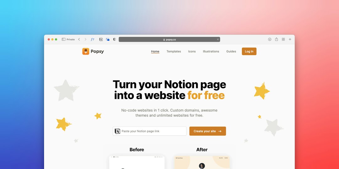
The first CTA should sit in the hero section. It should be visible without scrolling on desktop and mobile. This is where intent is highest. Visitors arrive, scan the headline, judge relevance, and decide whether to act or leave.
A strong hero layout usually includes:
- A clear headline focused on the product outcome
- A short subheading that explains who it helps
- One primary free trial CTA
- One secondary action, such as “Watch Demo” or “See Pricing”
- A trust signal near the button
The primary CTA should not fight with three other buttons. Too many choices slow people down. If the business wants trial signups, the free trial button gets the strongest visual weight. Secondary links should be softer, smaller, or outlined.
Honestly, it feels like some homepages hide the free trial behind two menus and a pricing page for no good reason. That extra path can add 15 to 30 seconds of pointless searching. Many visitors will not bother.
Repeat the CTA at Key Decision Points
One button at the top is not enough. Visitors need the CTA again after they gain confidence. The best positions usually are:
- Hero section: for high-intent visitors ready to start.
- After benefits: once the visitor understands the product value.
- After social proof: once claims feel more believable.
- Near pricing preview: when cost and plan fit are considered.
- Final homepage section: for visitors who scroll to the end.
Each CTA can use the same action, but the supporting text should match the section. After testimonials, copy could say, “Join 8,000 teams already saving 6 hours a week.” Near pricing, it could say, “Try the plan free before paying.”
Design the Button for Speed and Clarity
The CTA button must be easy to spot. Contrast matters. Size matters. White space matters. If the button blends into the background, the design has failed.
A high-converting button often follows these rules:
- Use a high-contrast color that stands apart from the page.
- Keep the label short, usually two to five words.
- Make it large enough for mobile thumbs.
- Place it near the headline and supporting copy.
- Use active verbs such as “start,” “try,” or “create.”
Microcopy can reduce anxiety. Short lines near the CTA can say “No credit card required,” “Cancel anytime,” or “Setup takes 2 minutes.” These small details handle objections before they grow.

Remove Friction From the Free Trial Path
Every field in a signup form has a cost. Name, email, password, company size, phone number, job title, team size, budget, and referral source may help sales. But they can harm trial starts.
For most homepage free trials, the first step should ask for the least data possible. Email and password may be enough. Single sign-on can help even more. It drives teams crazy when a product promises a quick trial, then asks nine questions before the dashboard appears.
If the sales team needs details, the product can ask later. After the user reaches value, there is more trust. A profile prompt inside the app often feels less painful than a wall of fields before access.
Support the CTA With Proof
A free trial CTA becomes more persuasive when it is surrounded by proof. Visitors need signs that the product works and that other people trust it.
Useful proof includes:
- Customer logos from known brands
- Short testimonials with names and roles
- Ratings from review platforms
- Usage numbers, such as “Used by 12,000 teams”
- Outcome data, such as “Cuts reporting time by 38%”
Proof should be close to the CTA, not buried at the bottom. A quote under the hero button can work well. So can a small logo strip below the fold. The goal is simple: reduce doubt at the moment of action.
Use CTA Copy That Matches the Trial Model
Not all trials feel the same. The CTA should reflect the offer.
- No credit card trial: “Start Free Trial, No Card Needed”
- Credit card required: “Try Free for 14 Days” plus clear billing terms
- Freemium signup: “Create Free Account”
- Guided trial: “Book Free Trial Walkthrough”
- Product demo trial: “Try Demo Workspace”
If a credit card is required, the homepage should say so before signup. Hiding that detail may increase clicks, but it can lower completed trials and damage trust. A cleaner path usually wins over trickier wording.
Optimize for Mobile First
Mobile visitors scan fast. They need a CTA that appears early, loads quickly, and works with one thumb. The hero copy should be shorter on small screens. The CTA should not sit below a huge image or oversized menu.
A sticky bottom CTA can help on mobile, especially for long homepages. It should be slim and clear. If it covers content or blocks chat widgets, it becomes annoying. The trial action should feel available, not forced.
Image not found in postmetaTest One Element at a Time
CTA testing works best when changes are clean. If the team changes the headline, button color, form, and pricing copy at once, it will not know what caused the result.
Good tests include:
- “Start Free Trial” versus “Try Free for 14 Days”
- Button color contrast changes
- Hero CTA only versus repeated CTA sections
- Short form versus longer form
- “No credit card required” microcopy versus no microcopy
The main metrics should include CTA click rate, trial completion rate, activation rate, and paid conversion rate. A CTA that gets more clicks but fewer activated users may not be the winner.
FAQ
Where should a free trial CTA be placed on a homepage?
It should appear in the hero section above the fold, then repeat after benefits, proof, pricing details, and the final homepage section.
What is the best CTA text for a free trial?
“Start Free Trial” is a strong default. More specific versions, such as “Try It Free for 14 Days” or “Create Free Trial Account,” can work better when they match the offer.
Should the CTA mention no credit card required?
Yes, if true. “No credit card required” reduces risk and can increase completed signups.
How many free trial CTAs should a homepage have?
Most homepages benefit from three to five CTA placements. The action should stay consistent, while supporting copy can change by section.
What should be tested first?
The team should test CTA copy, hero placement, form length, and risk-reducing microcopy first. These changes often affect conversions quickly.