


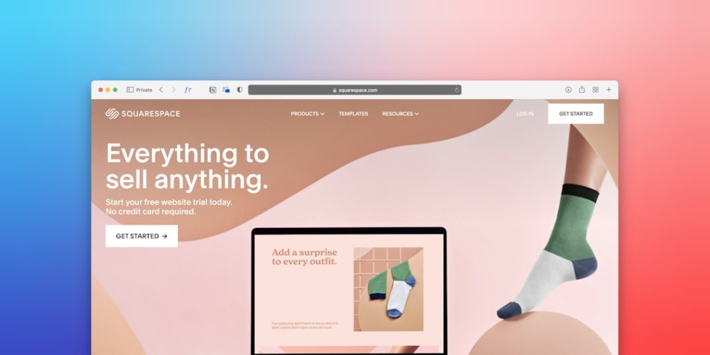
Put your free trial CTA where people can see it, understand it, and click it without thinking too hard. That is the whole game. A free trial button is not decoration. It is a tiny doorway to revenue. Make it clear, make it tempting, and make it easy.
TLDR: Your free trial CTA should be visible above the fold, repeated in smart places, and paired with a clear benefit. For example, a SaaS company moved its “Start Free Trial” button from the footer to the hero section and saw trial sign-ups rise from 4.2% to 7.8% in 30 days. Keep the form short, remove fear with “No credit card required,” and test one change at a time.
Start with one clear promise
People do not click because a button exists. They click because the next step feels worth it.
Your CTA should answer one simple question:
“What do I get if I click this?”
Bad CTA copy says:
- Start
- Submit
- Click Here
- Try Now
Better CTA copy says:
- Start Your Free Trial
- Try It Free for 14 Days
- Create My Free Account
- Get My Free Demo Workspace
See the difference? The better versions feel useful. They tell users what happens next. No guessing. No tiny panic.
The catch is that many company websites treat CTAs like afterthoughts. A button hides in the corner. The copy is vague. The form asks for a phone number, company size, shoe size, and possibly a blood sample. Nobody has time for that.
Place the CTA above the fold
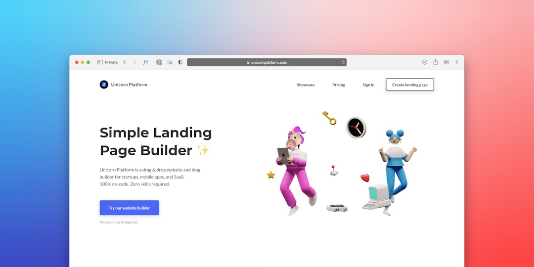
Your first free trial CTA belongs near the top of the page. Put it in the hero section. This is the area people see before they scroll.
Use this simple layout:
- Headline: Say the main benefit.
- Subtext: Explain who it helps.
- CTA button: Offer the free trial.
- Trust note: Remove risk.
Example:
Headline: “Plan Projects Without the Spreadsheet Mess”
Subtext: “A simple task planner for small teams.”
CTA: “Start Free Trial”
Trust note: “14 days free. No credit card required.”
That last line matters. It lowers the mental wall. People hate surprise charges. Honestly, it feels like every trial wants your card before you even know if the tool is useful. If you do not need card details, say so loudly.
Repeat the CTA, but do not shout
One CTA is not enough. People scroll. They compare. They get distracted. They read reviews. Then they may be ready.
Add your free trial CTA in these spots:
- Hero section
- Top menu
- After key benefits
- Near pricing
- After testimonials
- At the bottom of the page
Keep the main CTA wording consistent. If the top button says “Start Free Trial,” do not switch to “Get Started,” “Join Now,” and “Open Account” all on the same page. That creates friction.
Use one main action. Then support it with a softer option if needed.
For example:
- Main CTA: Start Free Trial
- Secondary CTA: Watch 2 Minute Demo
This works well for visitors who are interested but not ready. They can still move forward.
Make the button impossible to miss
Your CTA button should stand out from the rest of the page. Not in a circus way. Just enough to say, “Hey, this is the next step.”
Use a strong color contrast. If your website is mostly blue, a yellow or green button may pop. If your site is white and black, a bold accent color can work well.
Also, give the button breathing room. Do not trap it between five icons, three badges, and a stock photo of someone smiling at a laptop. Space helps the eye find it faster.
Good button rules:
- Use large, readable text.
- Make it look clickable.
- Use enough padding.
- Keep it away from clutter.
- Use the same style across the site.
Pair the CTA with real benefits
A free trial is not the benefit. It is the access point.
Tell users what they can do during the trial. Be specific.
Instead of:
“Try our platform for free.”
Say:
“Build your first invoice, send it to a client, and track payment in under 10 minutes.”
That feels real. It gives the user a tiny story. They can picture the win.
Here are a few benefit-led CTA support lines:
- “Set up your dashboard in 5 minutes.”
- “Invite your team for free during the trial.”
- “Cancel anytime before the trial ends.”
- “Get access to all core features.”
Small details calm people down. Calm people click.
Keep the sign-up form short
This is where many websites ruin everything.
Someone clicks your free trial button. Great. Then they see a form with 12 fields. Not great. Expect drop-offs.
Ask only for what you need right now.
Best starting fields:
- Name
- Password
Maybe add company name if it truly matters. Skip phone number unless sales follow-up is part of the offer. Even then, test it. Phone fields can scare people off.
A good rule: If the field does not help the user start the trial, remove it.
You can collect more details later. Once users see value, they are more willing to share.
Remove fear near the CTA
People worry before they sign up. Common worries include:
- Will I be charged?
- Can I cancel?
- Is setup hard?
- Will sales call me five times?
- Is this worth my time?
Answer these fears right beside the CTA.
Try short trust lines like:
- No credit card required
- Cancel anytime
- Setup takes 3 minutes
- No spam. No pushy calls.
- Used by 8,000 teams
Do not bury these details in a FAQ at the bottom. Put them where the decision happens.
Use social proof near the free trial CTA
People trust other people. Shocking, right?
Add proof close to the button. Keep it short. A giant wall of praise will slow the page down.
Good proof examples:
- “Rated 4.8 out of 5 by 1,200 users”
- “Trusted by 12,000 small businesses”
- “Saved our team 6 hours each week.”
If you have logos, use only the strongest ones. If you use testimonials, pick quotes with numbers. “This tool is great” is weak. “We cut reporting time by 40%” is much better.

Match the CTA to the page
Not every visitor is in the same mood.
Someone on your homepage may need a broad CTA. Someone on your pricing page is closer to deciding. Someone reading a feature page wants proof that the feature solves their problem.
Match the CTA to intent.
- Homepage: “Start Your Free Trial”
- Feature page: “Try This Feature Free”
- Pricing page: “Start 14 Day Free Trial”
- Comparison page: “Switch and Try Free”
- Blog post: “Use This Template Free”
This makes the CTA feel more personal. It also makes the next step more logical.
Test one thing at a time
Do not change the headline, button color, form, and page layout all at once. You will not know what worked.
Test one item at a time:
- Button text
- Button color
- CTA placement
- Trial length
- Credit card requirement
- Form length
Track simple numbers:
- CTA click rate
- Form completion rate
- Trial activation rate
- Trial to paid conversion rate
For example, a page may get a 12% CTA click rate but only a 22% form completion rate. That means the button works, but the form is the problem. Fix the form first.
Make the post-click experience smooth
The CTA is only the start. After the click, users need a fast win.
Do not drop them into a blank dashboard and hope for magic. Give them a checklist. Show a sample project. Offer a quick setup guide.
A strong first screen might say:
- “Create your first project”
- “Invite one teammate”
- “Try a sample workflow”
That first win matters. If users feel progress in the first session, they are more likely to return.
Final tips for a better free trial CTA
- Be clear. Clever copy loses when users are busy.
- Show value fast. Tell users what they get.
- Reduce risk. Use lines like “No credit card required.”
- Repeat the CTA. Add it where users are ready.
- Cut form fields. Fewer fields usually means more sign-ups.
- Measure everything. Guessing gets expensive.
A great free trial CTA feels like a friendly nudge. Not a trap. Not a demand. Just a clear next step that says, “Try this. It might make your day easier.”