



Email typography has a quiet but powerful influence on how a message is perceived, read, and acted on. The best font for emails is not simply the most attractive option; it is the one that displays reliably across inboxes, supports fast reading, and reinforces a professional brand impression.
TLDR: The best professional email fonts are usually Arial, Verdana, Helvetica, Georgia, Tahoma, and Times New Roman because they are widely supported and easy to read. Sans serif fonts are often preferred for modern business emails, while serif fonts can work well for formal or editorial communication. Web safe fonts improve consistency across devices and may support better engagement, while image only text and unusual fonts can harm readability and deliverability.
Why Email Font Choice Matters
Font selection affects more than visual style. In professional email communication, typography shapes trust, clarity, and accessibility. A poorly chosen font may look elegant in one inbox but appear broken, cramped, or substituted in another. Since email clients such as Gmail, Outlook, Apple Mail, and Yahoo Mail render fonts differently, reliable typography is essential.
Readability also influences performance. If subscribers struggle to scan a message, they are less likely to click, reply, or continue reading. In business communication, a clean and familiar font helps the recipient focus on the message rather than the design.

What Makes a Font Good for Email?
The best email fonts share several qualities. They are clear at small sizes, widely available across operating systems, and suitable for both desktop and mobile screens. A strong email font should also match the tone of the message.
- Readability: Letters should be easy to distinguish, especially on mobile devices.
- Compatibility: The font should render consistently across major email clients.
- Professional appearance: It should support the sender’s credibility and brand voice.
- Accessibility: The font should work well for readers with visual impairments or reading difficulties.
- Fallback support: If the preferred font fails, the substitute should still look appropriate.
Top Professional Email Fonts
1. Arial
Arial is one of the safest and most commonly used email fonts. It is a sans serif typeface with clean lines and excellent compatibility. Because it is installed on most systems, it usually displays consistently in email clients.
Arial works well for newsletters, transactional emails, customer support messages, and internal communication. Its neutral style makes it suitable for almost any industry.
2. Verdana
Verdana was designed specifically for screen readability. It has wide spacing and large letterforms, which make it especially effective for mobile and smaller screens. For emails with dense information, Verdana can reduce eye strain and improve scanning.
However, because Verdana is wider than many other fonts, it may take up more horizontal space. It is best used when clarity is more important than compact design.
3. Helvetica
Helvetica is a modern, polished sans serif font often associated with clean branding and professional design. It is popular in corporate emails, product announcements, and brand newsletters.
Although Helvetica is widely used, it may not be available on every device. For that reason, email designers commonly pair it with Arial as a fallback, using a font stack such as Helvetica, Arial, sans serif.
4. Georgia
Georgia is one of the best serif fonts for email. It was created for screen display, making it easier to read than many traditional serif typefaces. Its slightly formal style is useful for editorial newsletters, legal updates, educational content, and premium brand messaging.
Georgia adds warmth and authority without sacrificing readability. It is an excellent choice when a message needs to feel thoughtful, established, or content rich.
5. Tahoma
Tahoma is compact, crisp, and highly legible. It performs well in short business emails, system notifications, and interface style messages. Its narrow structure allows more text to fit into limited space while remaining clear.
Tahoma can feel slightly technical, so it often suits software companies, service providers, and operational communications.
6. Times New Roman
Times New Roman is a classic serif font with a formal tone. It is highly compatible, but it can feel traditional or outdated in modern marketing emails. Still, it remains useful for legal, academic, financial, and official communication.
When used carefully, Times New Roman can convey seriousness and authority. For promotional campaigns, however, a cleaner sans serif option may be more effective.
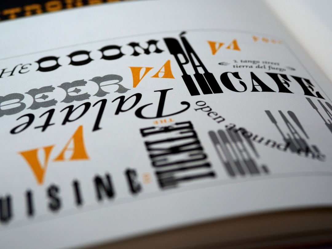
Sans Serif vs Serif Fonts in Email
Most professional email campaigns use sans serif fonts because they appear clean and readable on screens. Fonts such as Arial, Helvetica, Verdana, and Tahoma are ideal for short paragraphs, calls to action, and mobile first layouts.
Serif fonts, such as Georgia and Times New Roman, can add a more formal or editorial character. They work best for longer written content, thought leadership, or brands that want a classic feel. The right choice depends on the audience, industry, and message type.
Best Font Size for Emails
Font choice is only part of readability. Size, spacing, and contrast matter just as much. For body text, most professional emails perform best with a font size between 14px and 16px. On mobile focused emails, 16px is often the safest choice.
- Body text: 14px to 16px
- Headings: 20px to 28px
- Small labels or footer text: 12px to 13px
- Line height: Around 1.4 to 1.6 for comfortable reading
Text should also have strong contrast against the background. Dark gray or black text on a white background remains one of the most readable combinations for professional emails.
Fonts and Email Deliverability
Fonts do not usually determine deliverability on their own. Spam filters are more concerned with sender reputation, authentication, content quality, links, and engagement. However, typography choices can indirectly affect deliverability and performance.
For example, if an email relies heavily on images because the desired font cannot be rendered as live text, spam filters and recipients may respond poorly. Image only emails can look suspicious, load slowly, and create accessibility problems. Messages with readable live text are generally safer and more user friendly.
Unusual web fonts may also create display issues. If a custom font fails to load, the email client will substitute another font. A proper fallback stack helps maintain a professional appearance even when the first choice is unavailable.
Web Safe Fonts vs Custom Fonts
Web safe fonts are fonts commonly installed across devices and operating systems. They are the most reliable choice for professional emails. Custom fonts can support brand identity, but they are not consistently supported by all email clients, particularly some versions of Outlook.
A practical approach is to use a custom or brand font where supported, then define trusted fallbacks. For example, a polished font stack may include a preferred font first, followed by Arial or Helvetica, and then a generic sans serif category.

Email Font Best Practices
- Use no more than two fonts: One font for headings and one for body text is usually enough.
- Prioritize mobile readability: Many recipients read email on phones, so small or decorative fonts should be avoided.
- Avoid all caps for long text: It reduces readability and may appear aggressive.
- Choose clear fallback fonts: A strong fallback prevents broken or inconsistent layouts.
- Test across email clients: Messages should be checked in Gmail, Outlook, Apple Mail, and mobile inboxes.
- Keep branding subtle: Professional typography should support the message, not distract from it.
The Best Overall Font for Professional Emails
For most organizations, Arial is the best overall email font because it is reliable, neutral, and widely supported. Verdana is excellent when maximum readability is needed, while Helvetica offers a more refined modern look when supported. For formal or editorial communication, Georgia is often the strongest serif option.
The best choice depends on the message goal. A sales newsletter may benefit from Helvetica or Arial, a legal announcement may suit Georgia or Times New Roman, and a software notification may work best with Tahoma. In every case, readability and consistency should come before decoration.
FAQ
What is the best font for emails?
The best font for most professional emails is Arial because it is readable, neutral, and widely supported across email clients and devices.
Which fonts are safest for email?
The safest email fonts include Arial, Verdana, Helvetica, Georgia, Tahoma, and Times New Roman. These fonts are commonly available and display reliably.
Are custom fonts good for email marketing?
Custom fonts can be useful for branding, but they are not supported everywhere. Professional emails should always include web safe fallback fonts to protect readability.
What font size should be used in emails?
Body text should usually be 14px to 16px, with 16px preferred for mobile readability. Headings are commonly between 20px and 28px.
Can fonts affect email deliverability?
Fonts do not directly control deliverability, but poor font choices can reduce engagement or encourage image heavy designs. Live, readable text with reliable fonts supports a better user experience.
Is serif or sans serif better for email?
Sans serif fonts are generally better for most emails because they are clean and easy to read on screens. Serif fonts can work well for formal, editorial, or content heavy messages.