


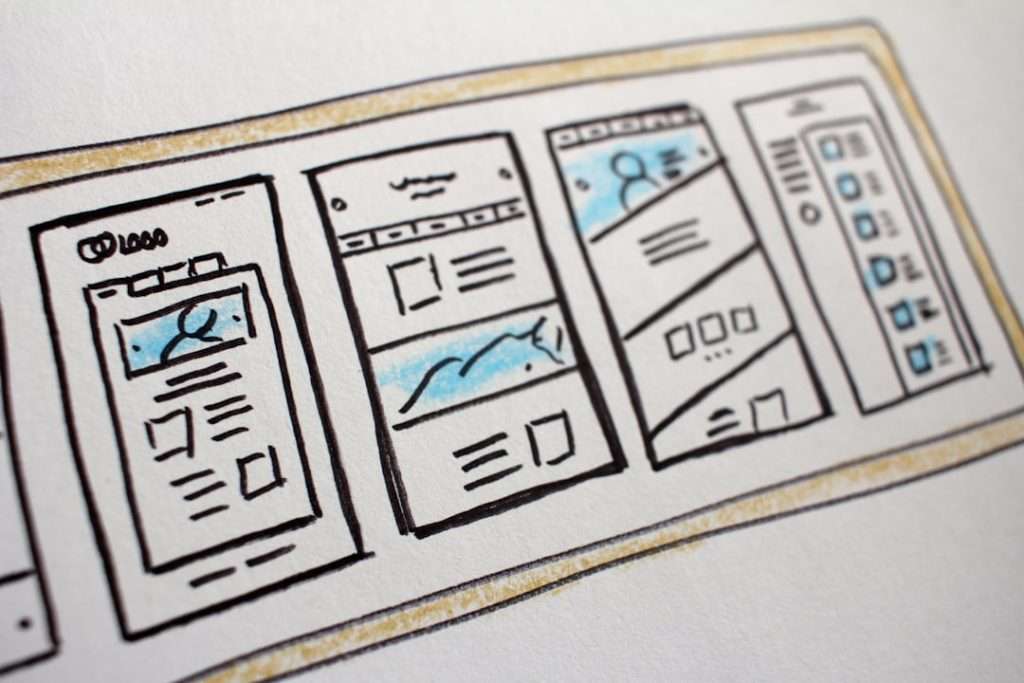
Pick Figma templates when your team needs speed, clarity, and shared design decisions; pick Framer templates when you need a prototype that feels closer to a real website or product. Figma is stronger for mapping flows, testing screens, and keeping everyone aligned. Framer is stronger when motion, responsive layouts, and publishable demos matter. The best choice is not about which tool is “better.” It is about how close your prototype needs to feel to the final product.
TLDR: Figma is usually the safer choice for rapid product prototyping because teams can move from idea to clickable flow in hours, not days. Framer is better when the prototype needs real scrolling, polished motion, or a public demo link that feels production ready. For example, a five person SaaS team testing a new onboarding flow might build 18 screens in Figma in one day, then move the winning concept into Framer and publish a landing style prototype that improves stakeholder feedback by 30%. If you only have one afternoon, start in Figma; if you need to impress users or investors, consider Framer.
Why templates matter in rapid prototyping
Prototype templates remove the blank canvas problem. They give you ready made layouts, component sets, interactions, and visual systems. That means your team spends less time arranging buttons and more time testing the product idea.
This matters because early prototypes are rarely about perfection. They are about questions. Can users understand the offer? Can they finish checkout? Does the dashboard make sense? Are the settings too buried? A good template helps answer those questions without forcing the product team to rebuild basic UI patterns from scratch.
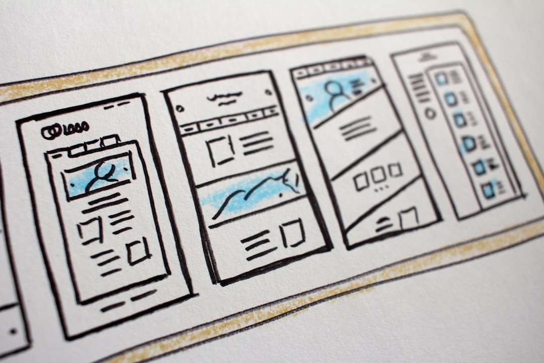
Figma templates: fast, familiar, and team friendly
Figma is the default choice for many product teams because it is easy to share, simple to comment on, and built around collaboration. Designers, founders, product managers, engineers, and marketers can all open the same file and point at the same screen. That alone saves time.
Figma templates are especially useful for:
- Wireframes: quick page structures before visual polish.
- Mobile app flows: onboarding, login, checkout, profile, settings.
- SaaS dashboards: data cards, filters, charts, tables, sidebars.
- Design systems: reusable buttons, fields, cards, modals, tabs.
- User testing: clickable paths with clear screen to screen logic.
The biggest advantage is speed. A polished Figma template can get a team from rough idea to testable prototype in a single workshop. Interactive components help simulate dropdowns, toggles, overlays, and menus. Auto layout keeps screens tidy when content changes. Comments keep feedback in context.
The catch is that Figma prototypes can still feel like linked screens. They are excellent for testing logic, hierarchy, and UX flow. They are less convincing when you need natural scrolling sections, layered motion, or a public demo that behaves like a live site. You can fake a lot, but after a point it starts to feel like workarounds stacked on workarounds.
Framer templates: closer to a real product feel
Framer templates shine when presentation quality matters. They are ideal for landing pages, marketing sites, interactive product demos, waitlists, and startup pitches. A Framer prototype can feel less like a mockup and more like something users can actually explore.
Framer templates often include:
- Responsive sections: layouts that adjust across desktop, tablet, and mobile.
- Motion presets: hover effects, page transitions, reveal animations.
- CMS style content: repeatable blog posts, cards, case studies, or feature lists.
- Publishable pages: shareable URLs that look like real websites.
- Interactive components: sliders, popups, accordions, and forms.
For teams building web first products, Framer can cut out a painful middle step. Instead of showing a flat concept, you can publish a responsive prototype and ask users to interact with it. That is useful for testing landing page copy, pricing pages, product tours, and feature announcements.
Honestly, it feels like Framer is at its best when the prototype needs to sell the idea. The animations are smooth. The page feels alive. The link is easy to send. But expect to waste time on details if your template is not structured well. Changing spacing across breakpoints can take longer than expected, especially when a simple section edit turns into a 12 minute hunt through nested layers.

Speed comparison: which gets you there faster?
For early product discovery, Figma is usually faster. You can duplicate screens, adjust components, and connect flows with minimal setup. If the prototype is for a usability test, internal review, or feature planning session, Figma wins most of the time.
Framer may be faster when your end goal is a polished web demo. If you already know the structure of the page, a good Framer template can produce a better looking result with less visual cleanup. It also saves time when stakeholders expect to click a real URL instead of opening a design file.
A practical split looks like this:
- First 48 hours of an idea: use Figma.
- Usability testing with task flows: use Figma.
- Investor or client demo: use Framer.
- Landing page validation: use Framer.
- Product architecture and UX mapping: use Figma.
Template quality matters more than the tool
A weak template in either tool can slow you down. Pretty screens are not enough. The template should be organized, named clearly, and built with reusable parts. If every button is detached, every card has random spacing, and every mobile screen is a manual resize job, the template becomes debt.
In Figma, look for templates with well built components, variants, auto layout, text styles, color styles, and clear page structure. A good Figma product template should let you swap content without breaking the layout.
In Framer, check responsive behavior first. Resize the canvas. Preview it. Click every menu. Test forms, animations, and mobile states. If the desktop version looks great but the mobile version collapses into chaos, skip it. Nothing kills a rapid prototype faster than fixing someone else’s messy breakpoints.

Collaboration and feedback
Figma is hard to beat for team feedback. Comments sit directly on the design. Multiple people can edit at once. Product managers can review flows. Engineers can inspect spacing and styles. Researchers can prepare test paths. It keeps the conversation close to the work.
Framer is also shareable, but the feedback model is different. It is better for reactions to the end experience. Does the page feel credible? Is the motion too much? Does the pricing section persuade? Does the demo feel real? These are valuable questions, especially for growth and launch work.
Which one should your team choose?
Choose Figma templates if your prototype is meant to test user flow, UI structure, app logic, or feature concepts. It is the better tool for messy thinking, quick revisions, and team alignment. It also plays nicely with design systems, research notes, and engineering handoff.
Choose Framer templates if your prototype needs to look and feel like a real web product. It is the better tool for landing pages, public demos, startup concepts, and polished interactive presentations. It can make an idea feel more complete, even before engineering starts.
The smartest workflow is often both. Start in Figma to shape the product. Test the core flow. Cut what does not work. Then move the strongest concept into Framer when you need a high fidelity web prototype that people can click, scroll, and believe. That keeps early work fast while still giving you a polished artifact when it counts.