Designing a logo might seem like a one-size-fits-all task, but when businesses expand into international markets like the United States, the United Kingdom, and Australia, subtle cultural and regional differences can have a big impact. Logos that work well in one country may feel out of place in another. Localization of a logo ensures that it resonates with the cultural norms, preferences, and legal standards of each target market.
TLDR (Too Long, Didn’t Read)
Localizing a logo for the US, UK, and Australian markets involves adapting typography, color schemes, symbols, spacing, and even taglines to appeal to each region’s cultural context. While the core branding should remain recognizable, localized adjustments can improve emotional resonance and brand perception. Paying attention to legal considerations, cultural sensitivities, and consumer expectations ensures a more seamless international brand presence. Don’t overlook professional feedback and user testing in each region before finalizing a localized logo.
1. Understanding Logo Localization
Logo localization is the process of modifying a company’s logo to cater specifically to a cultural or regional audience without losing the brand’s identity. While some might think of localization solely as translation, it’s much more comprehensive. This involves:
- Color adaptation
- Typography changes
- Symbol and icon modifications
- Spacing and layout reconfiguration
- Legal compliance
Each market has its linguistic quirks, cultural symbolism, and design sensibilities. Looking at the U.S., U.K., and Australian markets individually reveals unique challenges and opportunities in logo localization.
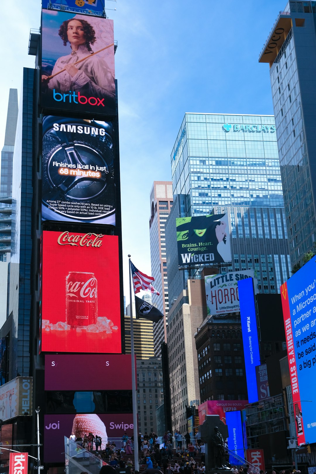
2. Logo Localization for the U.S. Market
The United States is a melting pot of cultures, which offers both flexibility and complexity in logo design. U.S. consumers favor bold, direct messaging. Here are essential considerations when localizing a logo for the American market:
- Font Style: Sans-serif fonts like Helvetica, Arial, and Gotham convey a clean and modern aesthetic well suited to American sensibilities.
- Color Preferences: Red, white, and blue often create patriotic associations. However, other palettes such as green (growth) or orange (innovation) are often welcomed in tech and health industries.
- Tagline Language: Use American English (e.g., “color” instead of “colour”). Keep language simple and punchy to match local advertising tones.
- Cultural Icons: Avoid region-specific imagery unless it aligns with the message. For example, using a bald eagle in a non-patriotic context may cause confusion.
Legal compliance also plays a role. Ensure the logo doesn’t infringe on existing trademarks in the U.S., which are enforced rigorously.
3. Logo Localization for the U.K. Market
British consumers appreciate elegance, wit, and a sense of tradition. The UK market tends to favor subtlety over flashiness, especially in sectors like finance, education, and publishing.
- Typography: Serif fonts like Georgia or Baskerville are often preferred in formal or heritage-focused sectors. Modern brands might still use sans-serif fonts but with subtle curvature and finesse.
- Color Schemes: Muted tones such as navy blue, burgundy, and forest green often resonate well, exuding professionalism and trustworthiness.
- Spelling: Always use British English (“colour” instead of “color”, “centre” instead of “center”). Typos or American spellings might harm credibility.
- Cultural Cues: The British market is sensitive to humor and irony. If you incorporate messaging or icons, these should reflect local attitudes and wit.
Also consider the diverse cultures within the United Kingdom. Scotland, Wales, and Northern Ireland each have distinct cultural elements. While a general UK version of the logo is often sufficient, hyper-localization may be necessary for region-specific campaigns.
4. Logo Localization for the Australian Market
Australia combines European design inclinations with American-style casual vibes. Australians appreciate uncomplicated visuals and a sense of humor, yet also value quality and clarity.
- Font Selection: Australians lean towards practical, readable fonts. Clean sans-serifs or soft-edged types work well across industries.
- Color Psychology: Earthy tones, oceanic blues, and sun-baked oranges often evoke the natural beauty of Australia. These tend to appeal to Aussie sensibilities.
- Language: Use Australian English (“organise” instead of “organize”). Subtle word choices and regional slang may help brands connect more intimately.
- Symbolism: Indigenous patterns, native animals, and local landmarks may be used carefully—but always respectfully—to reflect Australian identity.
Keep in mind that Australian consumers dislike overly corporate messaging. Aim for a tone that feels both sincere and relaxed. Visual storytelling through icons or simplified imagery often works better than intricate graphics.
5. General Tips for Multinational Logo Localization
Though each market has distinct requirements, some overarching strategies apply universally:
- Consistency vs. Flexibility: Ensure the localized logos are different enough to resonate locally, but consistent enough to be recognizable globally.
- Test with Local Audiences: Run focus groups or surveys in each market to gather feedback. A logo that offends or confuses can damage your brand’s trust.
- Avoid Over-Localization: Don’t try too hard. Overusing cultural symbols can come off as forced or inauthentic. Subtlety often goes further.
- Adapt Other Visual Elements: In conjunction with the logo, also localize packaging, website colors, and typography when possible to create a cohesive experience.
6. When to Consider Creating a Separate Logo
At times, localization might not be enough. Some businesses create entirely new logos for specific regions, especially when their core logo doesn’t translate culturally or legally. This should be a last resort, as it can dilute brand recognition. Use this strategy only when localization fails or the target audience responds unfavorably to the original brand aesthetic.
Frequently Asked Questions (FAQ)
-
Q: Should I create a different logo for each country?
A: Not necessarily. Localization may involve subtle changes in color, font, or layout without overhauling the entire logo. The goal is to retain branding while enhancing cultural relevance. -
Q: What is the biggest mistake in logo localization?
A: The most common mistake is over-complication or stereotyping. Overusing national symbols or ignoring local spelling conventions can harm credibility. -
Q: How can I make sure my logo is legally protected in each country?
A: Consult trademark attorneys within each country to ensure compliance and register your logo locally to avoid infringement issues. -
Q: Is it expensive to localize a logo?
A: It can vary. Non-design intensive changes like color or font tweaks are affordable, while complete redesigns or region-specific identity packages may be more costly. -
Q: Can I use AI to help localize my logo?
A: Yes, AI tools can provide mockups and suggest culturally appropriate elements, but always involve a local designer or cultural consultant for accuracy and nuance.
Final Thoughts
Logo localization isn’t just about visual adaptation—it’s about respect for cultural nuances, customer expectations, and regional language. Whether engaging audiences in the U.S., U.K., or Australia, a tailored visual identity boosts trust and reinforces your brand’s message on a global scale. By investing in thoughtful localization, businesses can position themselves as more relatable, professional, and culturally aware across markets.